Omniex

Unlocking Institutional Crypto
As an investment trading platform for digital assets, Omniex needed to shift their brand focus to their ideal clients – institutions. The Grove evaluated the existing brand and gave Omniex a new presence in the market – all with a strict focus on the target audience.
The existing logo contained multiple messages and identities conveyed by competing elements. The Grove recommended simplifying the logo to maintain a singular symbol – an orange ‘underscore’ – implying Omniex’s focus and stability for their clients.
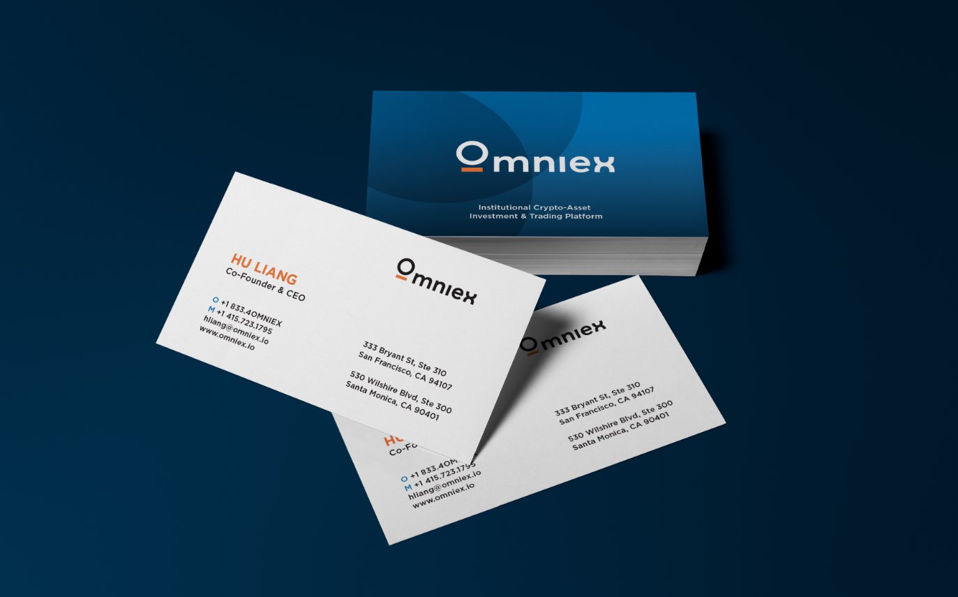
New application styles and color palettes were developed to give depth to the simplified logo, introducing new layering techniques and shapes. Uses of the ‘underscore’ were explored in content styling and various business collateral.
Omniex Icon
Omniex-iphone

Omniex font

Omniex Business Cards

Omniex Icons
Omniex Book Cover
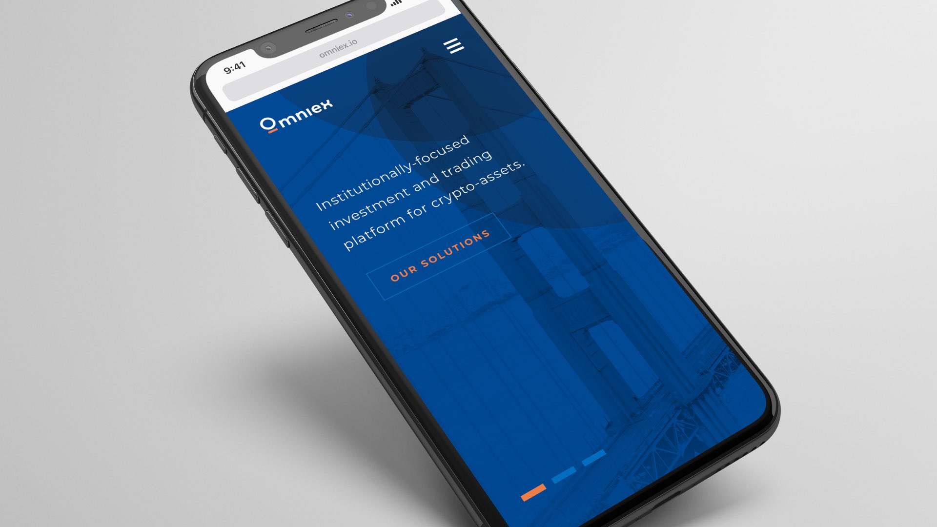
The new Omniex brand was extended to the website through modern typeface choices, color usage, photography styling, and diagrams – specifically designed for mobile responsiveness, which became a critical piece of Omniex’s marketing.
With an extensive amount of content to consider, website structure was key. Modular formatting and clean lines were necessary to ensure that the website provided a good user experience – helping to lead the user through the large sections of text.

Omniex Laptop