Silke Salon
Establishing a consistent brand across multiple customer touchpoints and products.
Silke Salon is a premier hair salon located in Winston-Salem, known for providing high-quality hair services to their clients. They offer a wide range of services, including haircuts, coloring, styling, and extensions. Their experienced and friendly staff ensures that each client receives personalized attention and leaves the salon feeling confident and beautiful.
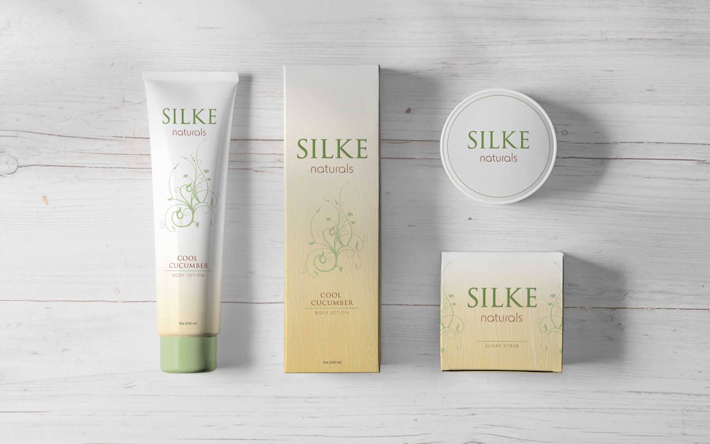
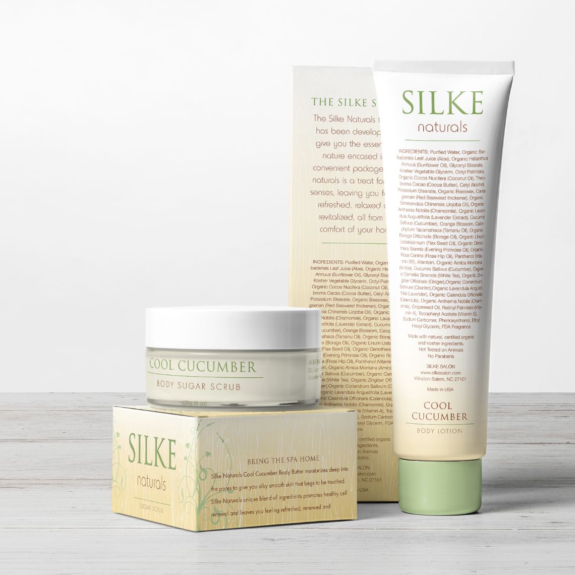
Our team was tasked with creating a unique visual identity for Silke Salon, which included a modern and elegant logo design and a color scheme that reflects the salon’s upscale and sophisticated brand image. We extended this branding to the packaging of Silke Salon’s private label skin care products, creating a cohesive and recognizable look across all touchpoints.
Services:
Brand Identity + Collateral
Packaging Design
Visual Approach
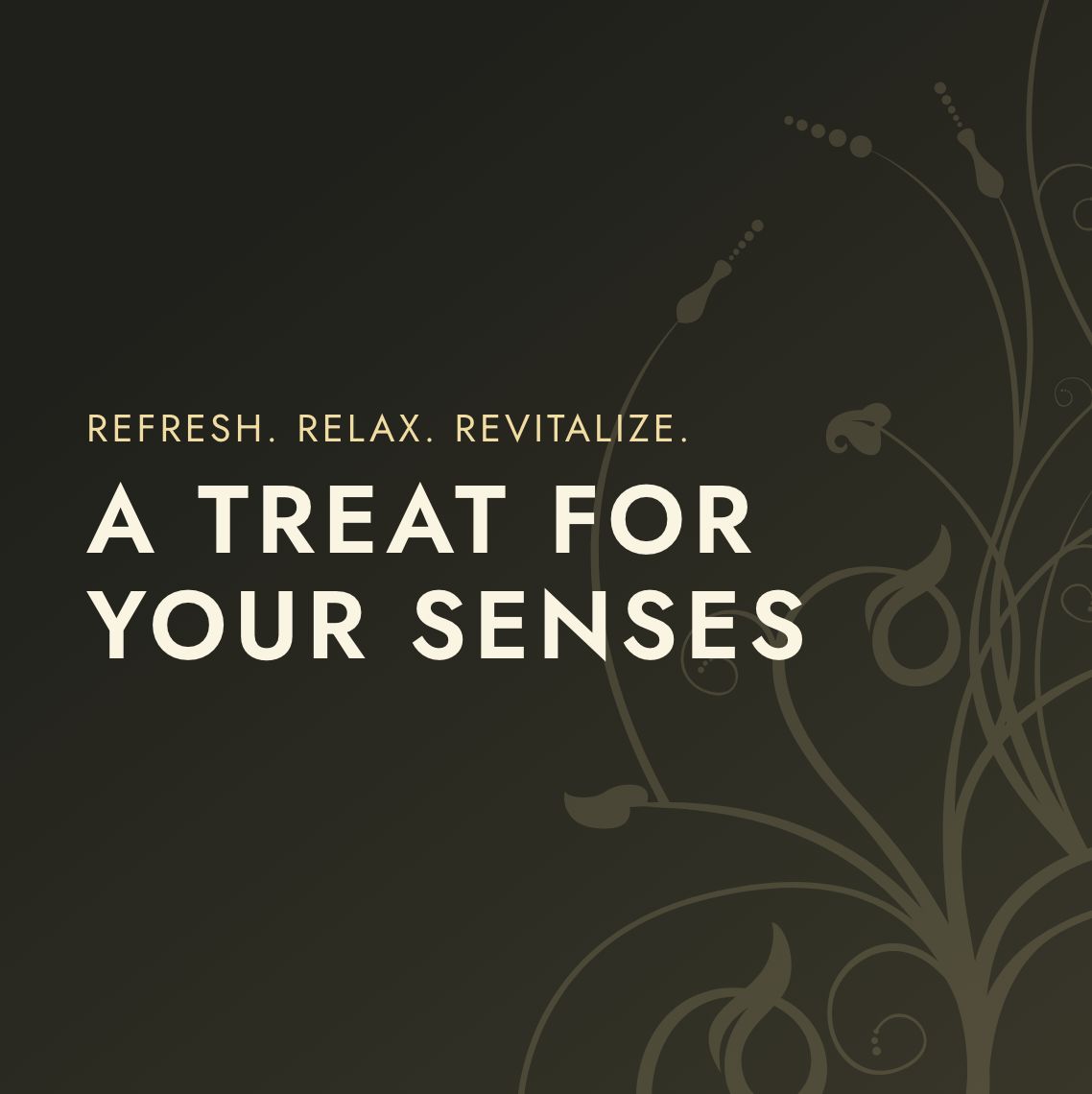
Our team shaped the Silke Salon’s visual identity by focusing on the linear elegance of classical architecture and the organic lines found in nature.
We drew from the structured forms of columns and the refined symmetry of architectural elements, seamlessly integrating these with the flowing curves and natural patterns.
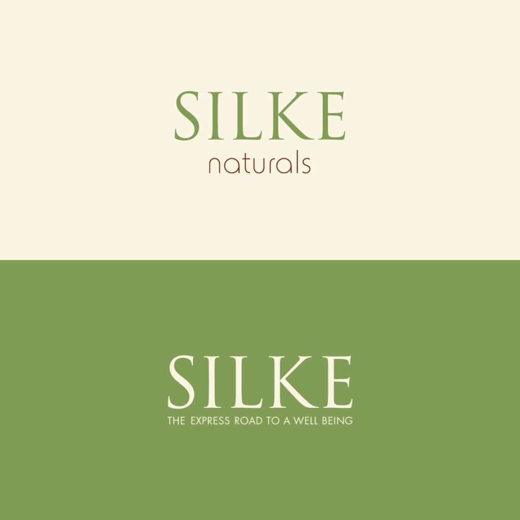
Logo Design & Brand Identity
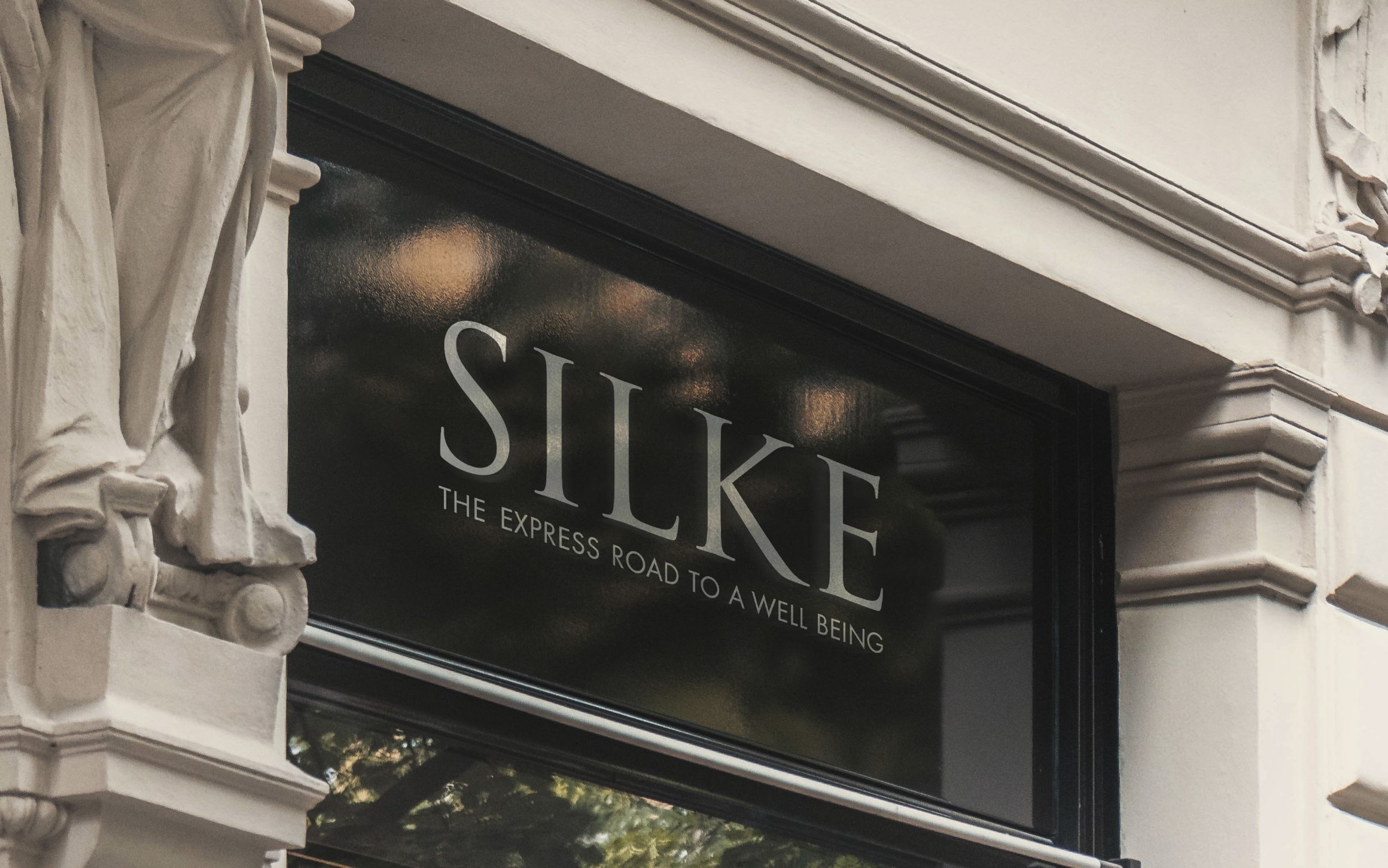
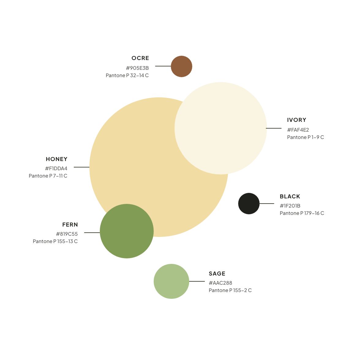
The Silke wordmark, inspired by the Trajan typeface, echoes classical columns’ refined and timeless forms, symbolizing strength and elegance. To complement this architectural influence, the color palette was thoughtfully selected to soften the visual identity, introducing hues that create a calming connection to natural beauty.
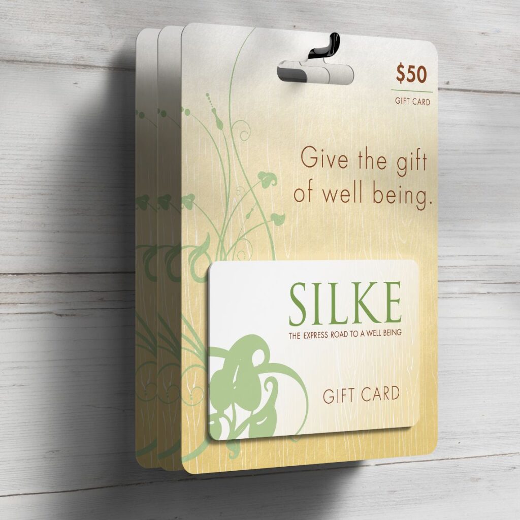
Packaging & Point of Sale
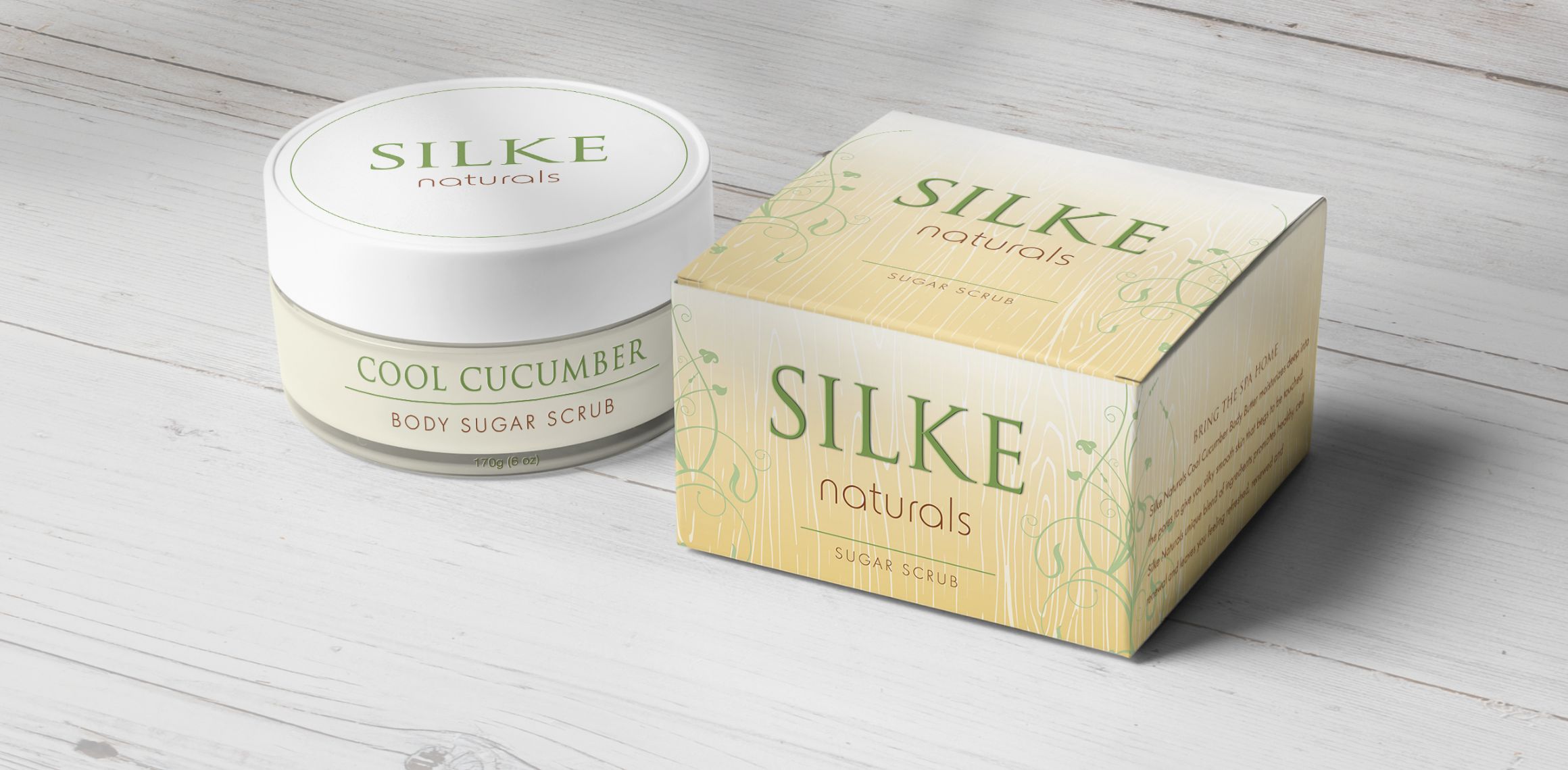
Our team expanded the Silke visual identity to packaging, point-of-sale materials, and other customer-facing elements, ensuring a cohesive and elegant brand experience.
This approach reinforced the brand’s connection to both classical elegance and natural beauty, maintaining a seamless visual narrative across all customer interactions with the Silke brand.
Cultivating Recognition Through Sophisticated Branding
By creating a striking visual identity merging classic elegance with natural beauty, our team ensured a cohesive and sophisticated brand experience, effectively supporting the successful launch of the Silke Salon brand.